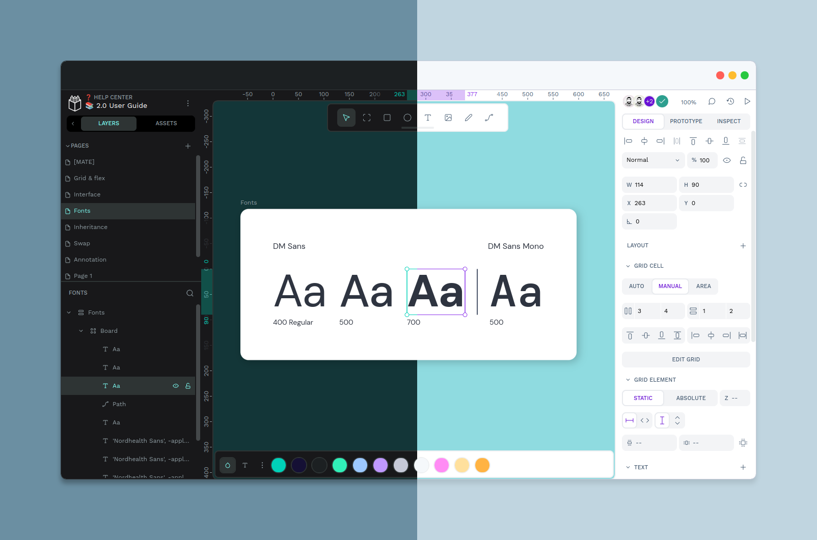
Just this once, I want to talk about Penpot and the response I have received after launching Penpot 2.0, which has made me more optimistic than ever before about the future of collaborative design.
On April 9th, we launched Penpot 2.0. The latest iteration of our product is the result of years of fine-tuning, refining, and most of all, listening. The feedback from our community has been at the heart of our work since we launched Penpot’s first iteration. After all, who better to find the areas that need improvement than the people we built this tool to serve?
With Penpot 2.0, we wanted to do more than just respond to specific requests. We wanted to provide services not offered anywhere else, getting ahead of the changing landscape and delivering the top-tier quality our users deserve.

Penpot 2.0 has been out for 14 days, and so far it looks like we succeeded in our mission to deliver for our community. The feedback we have been receiving is more than we could have imagined. I wanted to take this opportunity to highlight some of the wonderful commentary we have seen so far.
“The UI looks a lot cleaner! I dig the new placement of the toolbar and the new layers icons (it’s great to have the collapse arrow on the left of the layers as well). It’s a lot more consistent with the industry standard.”
“First impression, the UI looks gorgeous. I have tried quickly the flexbox layout, grid layout, creating a colour palette, a typography scale. And all went without needing to consult any instructions. Kudos for all these.”
“What I love: The UI is looking better with each update, I love the new fill window UI. I love how snapping to rulers works now, it’s consistent with my expectations.”
“Thank you for adding a light mode! I have astigmatism and the halation on the v1 dark UI is tough some days.”
“I love that Penpot's open source - many enterprises would love some ability to add features or fork the editor, since design files are so critical to development these days.”
“Kudos to your team. I am happy to see Penpot updates because it brings me closer to migrating to your software from Figma completely (at least for freelance/personal work) at some point.”
Of particular meaning to me are comments about the clarity and ease of use. Accessibility has always been a critical issue for me, and for many designers and devs that find themselves unable to navigate each other's territory. Fostering effective collaboration between devs and designers is not easy when the two groups often speak different languages, have different priorities, and use different tools. This disconnect can lead to misunderstandings, delays, and even conflicts that can hinder the success of a project.
It's hard to overstate the impact that proper collaboration can have on the quality of the final product. When devs and designers work together, they have the capacity to create digital experiences that are not only beautiful but also functional and user-friendly.
We know this is not the end of the road for Penpot 2.0. After all, the beauty of open source is in the possibility for endless evolution and growth. We continue to keep a close eye on your feedback to make this tool the best it can be. But in the meantime, we want to take this moment to celebrate with the community that made this all possible. The best is yet to come!
Thank you
Those who follow me know that I don’t usually use this space to talk about my work with Penpot, but rather to dig into the issues at hand in the design/development community and promote cooperative solutions.
